Or, just look at the counties within a particular state, like Massachusetts:
Figure 2: Massachusetts counties’ net migration rates
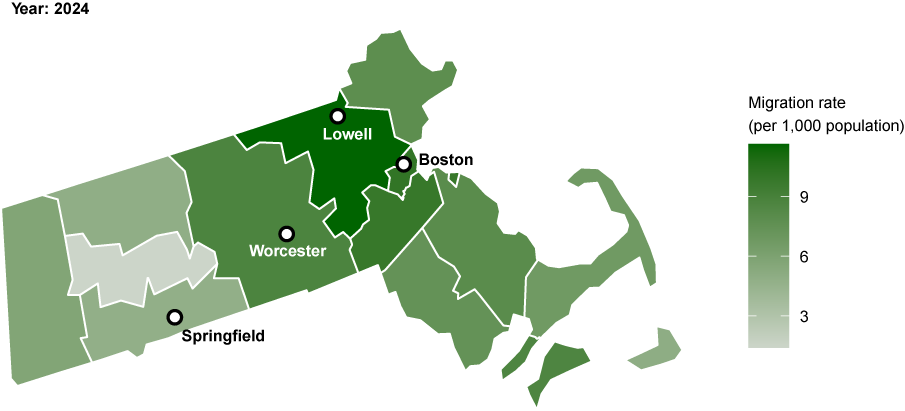
Source: Census Bureau Components of Population Change via StatsAmerica
2. Stacked Bar Chart: Population Drivers in a County
Pick one county (or a few peers) and show stacked bars of:
- Births minus deaths (blue)
- Net migration (orange)
- Total change (line marker)
Figure 3: Components of population change for selected Indiana counties
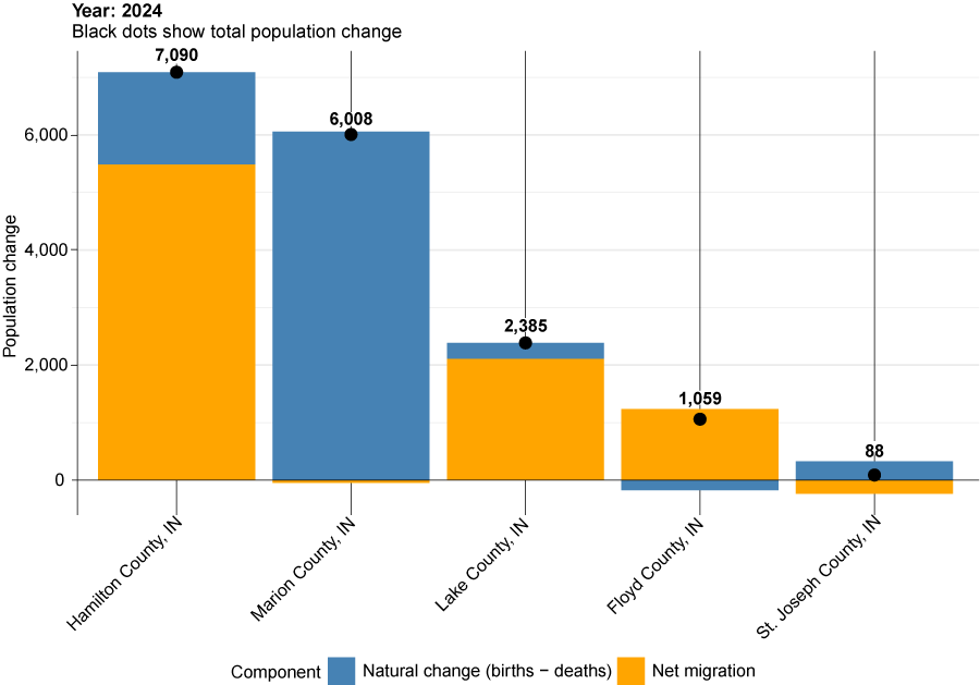
Source: Census Bureau Components of Population Change via StatsAmerica
A county with negative natural change (more deaths than births) but positive net migration is reliant on newcomers for growth (e.g., Floyd County). A county with a positive natural change but negative net migration is dependent on its population’s fertility for growth (e.g., Marion and St. Joseph counties).
3. County comparison grid
Create a grid of small bar charts showing all counties in your state, with each panel displaying natural change versus net migration for one county.
- Blue bars show natural change (births minus deaths)
- Orange bars show net migration
- A dashed line at zero helps identify negative values
Figure 4: Grid of components of population change for Arizona counties
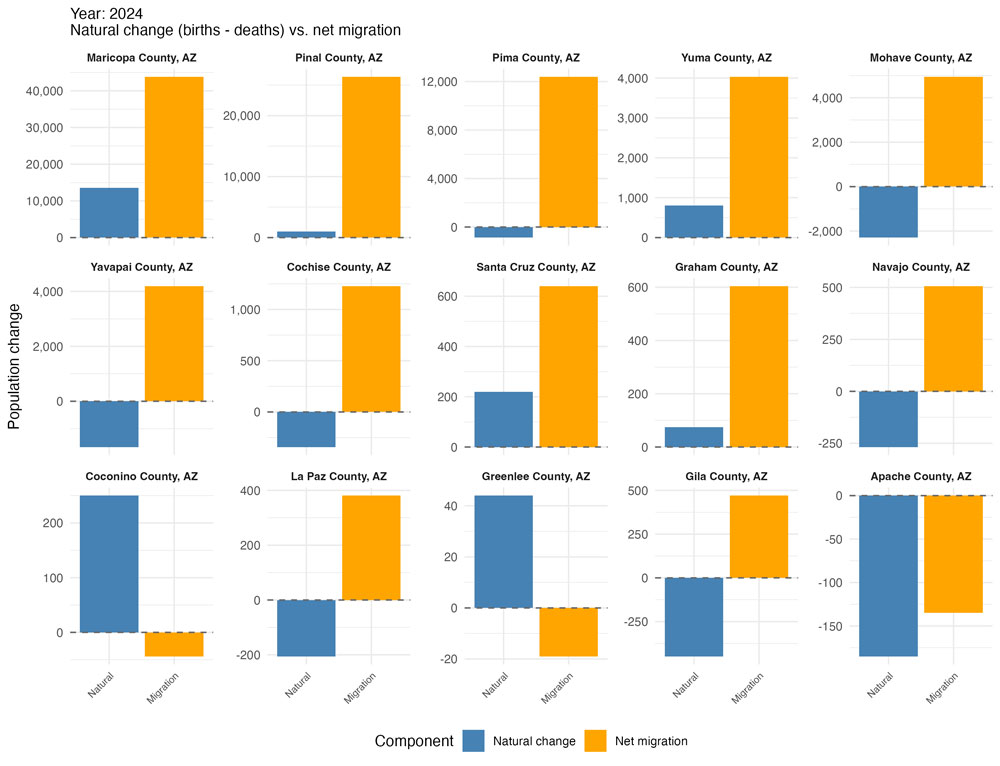
Note: Counties are ordered by total population change.
Source: Census Bureau Components of Population Change via StatsAmerica
This layout makes it easy to scan dozens of counties at once and quickly spot patterns: which counties are migration-driven, which rely on natural growth, and which face challenges on both fronts. Counties with large orange bars but small or negative blue bars are particularly reliant on attracting new residents for growth.
4. Time series: Natural change and migration
Create a line chart showing how natural change and net migration have evolved over time for a state or county.
- Blue line shows natural change (births minus deaths)
- Orange line shows net migration (domestic plus international)
- A dashed line at zero helps identify when components turn negative
- Points at each year mark the data
Figure 5: Minnesota population dynamics, 1991 to 2024
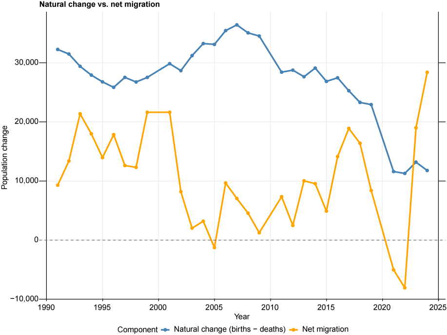
Source: Census Bureau Components of Population Change via StatsAmerica
This visualization reveals long-term demographic shifts, such as when a state transitions from natural growth to natural decline, or whether migration is becoming more or less important as a growth driver. It's particularly valuable for understanding how specific events (e.g., economic changes, recessions, pandemic impacts) have affected population dynamics and for long-term planning.
Note: Data for the decennial years 2000, 2010 and 2020 cover only a three-month period of those years (April through June). In other words, there is a nine-month break in this time series. For example, no data is available for the period between July 2019 and April 2020. Therefore, when creating charts like this, one should exclude the years of the decennial census for comparability.
Why it matters for economic development
Workforce planning: Migration-driven growth often means an influx of working-age adults. Natural growth tends to grow the school-age population.
Housing demand: High in-migration may signal a greater need for housing supply.
Long-term sustainability: Counties relying on natural growth alone may face challenges as birth rates decline nationally.
Grant proposals and planning documents: Demonstrating migration trends can strengthen applications by showing workforce availability or population need.
Watch out for …
Natural change can turn negative even in growing counties as the population ages; this is increasingly common across the U.S.
One-year spikes might reflect data anomalies or one-time events such as college enrollment changes or prison openings.
International migration includes both new arrivals and visa status changes, so the number may not represent only new immigrants to the U.S.
How to try this yourself
Visit the StatsAmerica Download Center.
Select Population > Components of Change (for the components of population change data) and/or Population > Population Estimates and Decennial Census (for the population estimates and counts data).
Download and extract the county-level data (CSV).
Use your preferred analysis tool (Excel, Tableau, R, etc.) to replicate the examples above.
Download the script to replicate the visualizations using R »
Pair with other StatsAmerica data (income, employment, labor force) for deeper insights.
Key takeaway
Growth isn't one-size-fits-all. A county gaining residents through migration faces different opportunities and challenges than one growing through births alone. By unpacking the drivers of population change, economic developers can better target strategies for workforce attraction, housing, and long-term resilience.