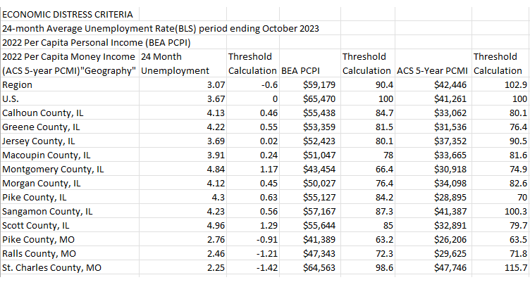
For this tutorial, we’re using some data from the Measuring Distress county tool on StatsAmerica. We selected a few contiguous counties in Illinois and Missouri and downloaded the data into Excel. See Figure 1 for a screenshot of how the data looks in its raw format.
Figure 1: Raw Measuring Distress data in Excel
First, let’s establish what kind of data we want. We want a “tidy” dataset, wherein each variable is a column, each observation is a row, each cell is a single value and each variable is uniquely named.2 This data, as presented above, is close to tidy but not quite. There are three columns named “Threshold Calculation,” and the first column contains names for two different columns, “2022 Per Capita Money Income (ACS 5-year PCMI)” and “Geography.” In addition, the dollar signs, while suitable for analysis in Excel, could cause some programming languages to recognize these columns as text, which is incorrect.
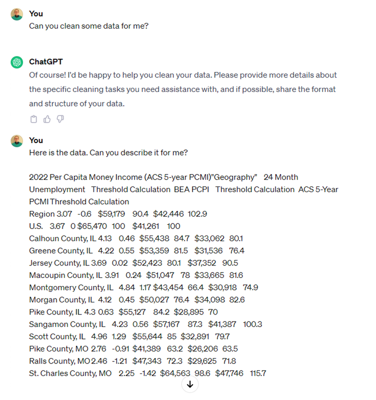
Let’s ask ChatGPT to help us tidy this dataset. Navigate to chat.openai.com (sign in or create an account if it asks you to), then copy and paste the data, starting with row 4, into a new chat session. (see Figure 1).
Figure 2: Preparing ChatGPT with a query and data
We asked it to describe the data to get a sense for what it thinks it contains and its structure. Its response to us is below.
Figure 3: ChatGPT's description of our data
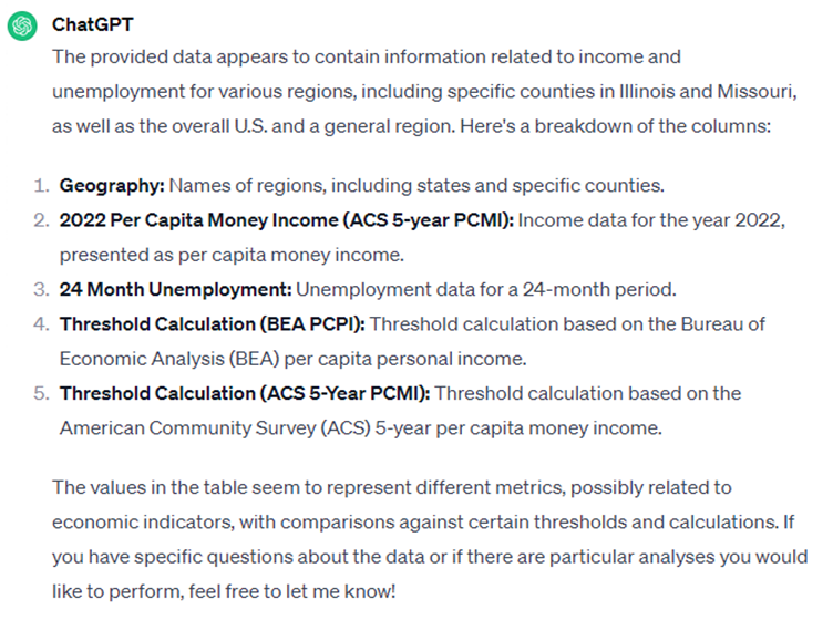
Not bad. However, it didn’t catch all the columns, and we don’t trust that it truly understands what the threshold calculation columns refer to. Let’s offer some guidance.
Figure 4: Asking ChatGPT to rename columns based on other columns
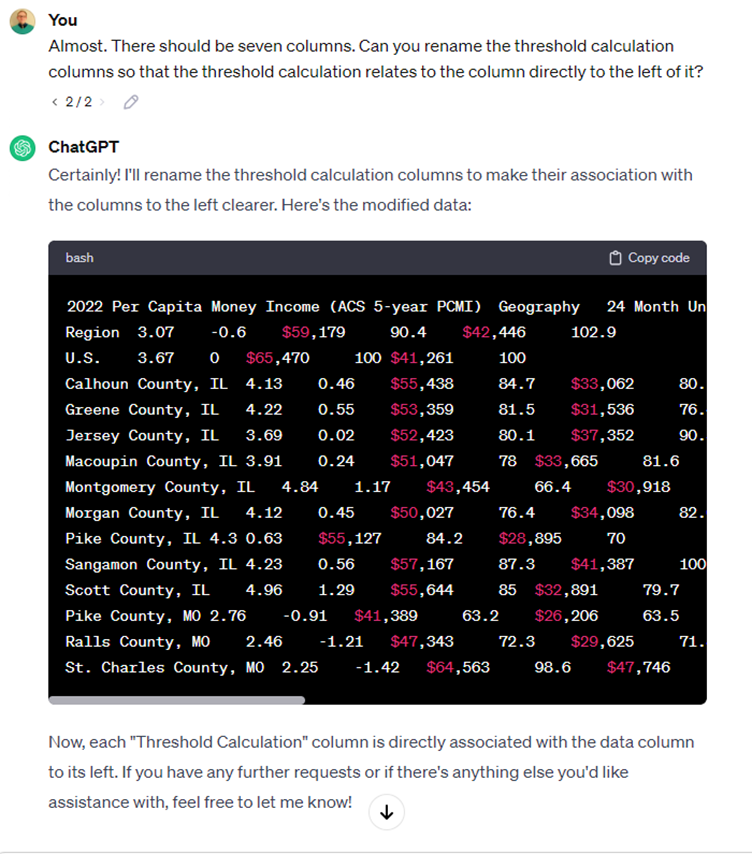
You can’t see in the screenshot, but it did correctly rename the threshold calculation columns to be associated with the columns to their left.
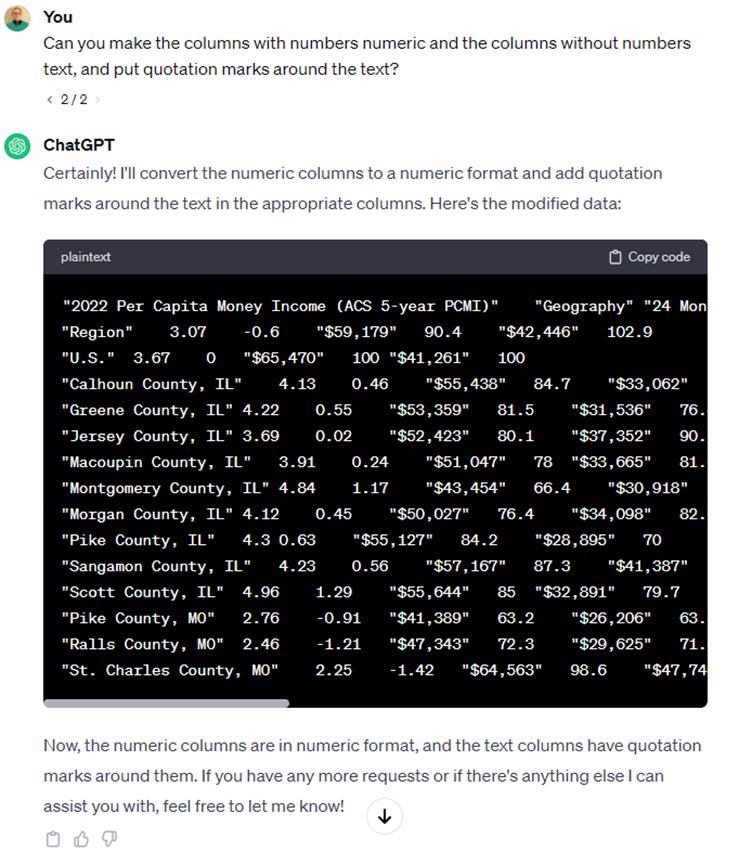
You commonly see data that contains both text and numbers with quotation marks around the text columns, so let’s ask it to do this. We also want to make sure numeric columns are classified as numeric.
Figure 5: Asking ChatGPT to format the columns
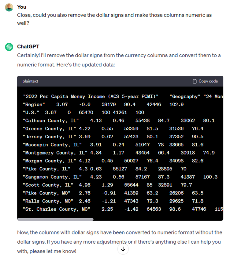
We forgot to ask it to remove the dollar signs, so let’s take care of that so these columns are correctly specified as numeric.
Figure 6: Refining the column and data formatting
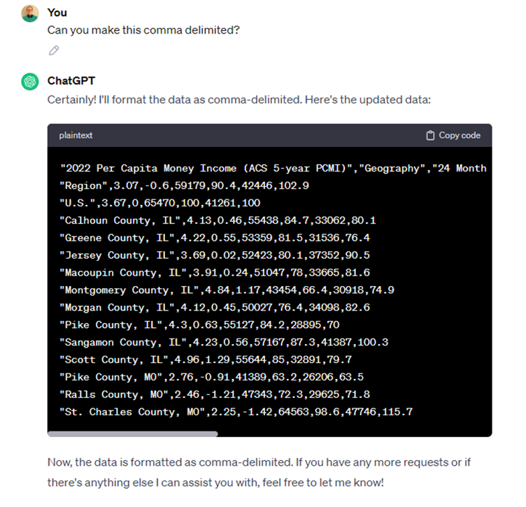
Now we’re cooking. We want this to be a comma delimited file so we can import it into Excel or another statistical analysis tool.
Figure 7: Asking ChatGPT to make a comma delimited file
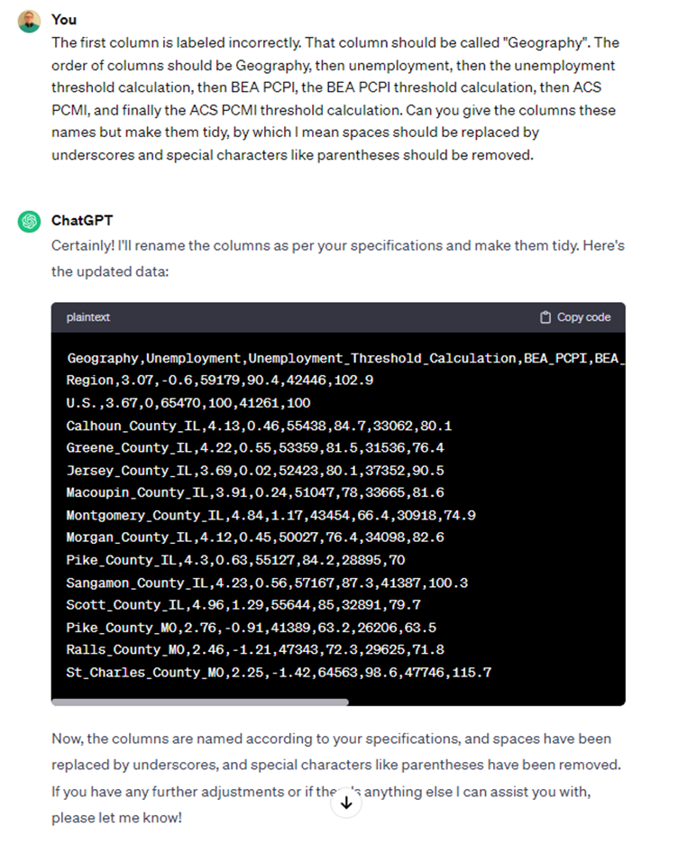
Wait... we just noticed an issue with the first column. It should be named “Geography”. Just to be sure, let’s specify how the columns should be ordered explicitly to ensure we get what we want on the first try. In addition, we want the column names to also be “tidy,” so spaces should be replaced with underscores and special characters like parentheses should be removed.
Figure 8: Asking for a few more formatting tweaks
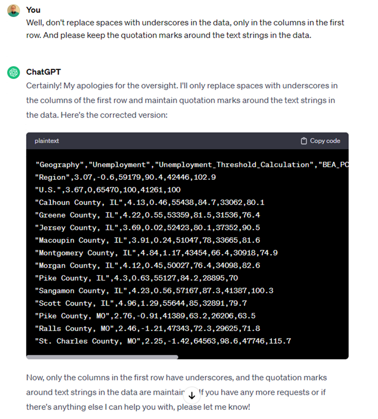
Alright, it took us a little too literally. We only need column names to be tidy; the observations can have spaces or special characters, provided they are text columns. It also removed the quotation marks, for some reason.
Figure 9: Putting finishing touches on formatting
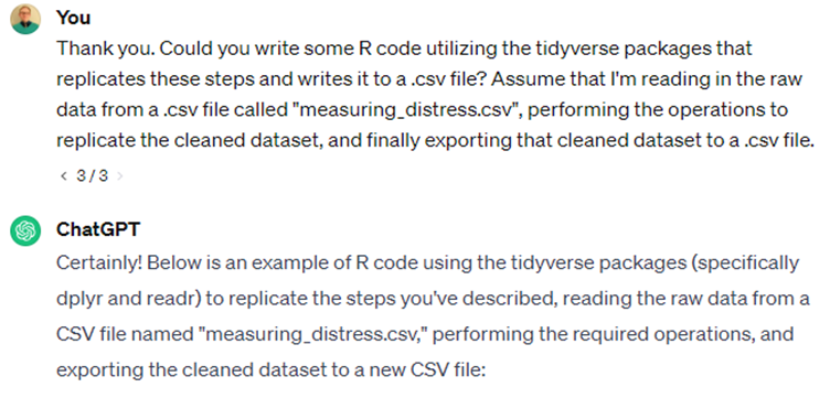
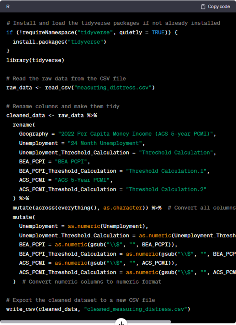
Looks pretty good! Now we have a clean and tidy dataset, suitable for further analysis. Let’s ask it to write an R script that replicates all these steps and exports the cleaned dataset to a .csv file.
Figure 10: Asking ChatGPT to replicate cleaning steps in R script
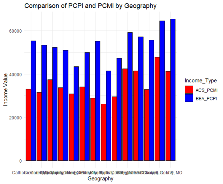
Note that some of the code is chopped off in the screenshot, but you get the gist. Finally, let’s ask it to use R to reshape the data so we can graph the two per capita income measures for comparison: per capita personal income from the BEA and per capita money income from the ACS. See txt file here.
Figure 11: Asking ChatGPT to reshape the data for graphing
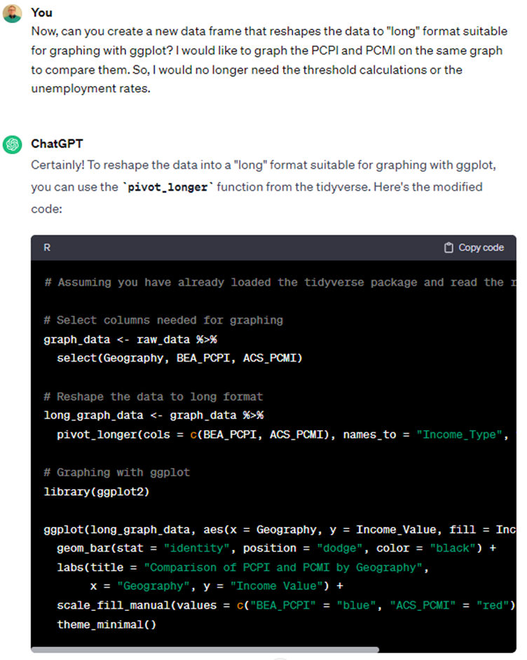
What’s interesting about this is that it recognizes what we mean by “long” data and writes the code to create the graph without explicit instructions to do so. It even “pretties” up the graph for us with colors, labels and a theme. See txt file here. When you run this code, R will generate a graph that looks like this.
Figure 12: The graph produced in R using ChatGPT's code