StatsAmerica’s States in Profile lets you access state data on a wide range of topics, from population, education, workforce and more, from a variety of sources, including the U.S. Census Bureau, U.S. Bureau of Economic Analysis, National Science Foundation and the U.S. Bureau of Labor Statistics. For this tutorial, we’re using data on household income.
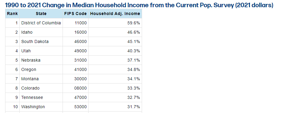
Start at the home page of States in Profile for whichever state you’d like. Under “Income & Taxes,” click “Median Income and Quarterly Earnings and Income,” then navigate to the second table, “Median Housing Income from the Current Pop. Survey (2021 dollars).” The last row is what we want: the percent change from 1990 to 2021. Click the link in the Rank column to get a list of all 50 states plus Washington, D.C., ranked by the percent change in median household income. You should be on this page (see Figure 2). Select the entire table, including the headings, but not including the title or footer, and copy it using Ctrl/Cmd + C.
Figure 2: Partial ranking of states by percent change in median household income from 1990 to 2021, adjusted for inflation
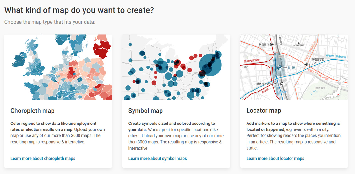
Now, navigate to the Datawrapper map creator to start building a map to visualize these data. It may ask you to login or create an account; you can bypass this by clicking “try out Datawrapper without signing up.” Your page should look like Figure 3.
Figure 3: Datawrapper map creator start page
We want to create a choropleth map, so select that option. Next, we must choose the geography we want the map to be. Halfway down the page is the option “USA » States,” so select the radio button next to it and click “Proceed.”
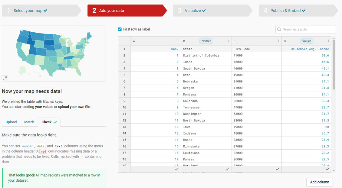
You should see a blank table on this page. To the left of the blank table is an option to upload a file or to “copy & paste your data (including header row/column).” Paste the copied table into the box and click the arrow next to it to transfer it to the table for inspection.
There should be 52 rows including the header rows, which should read “Rank,” “State,” “FIPS Code,” and “Household Adj. Income.” The FIPS code is incorrectly formatted like a number, so you can change it to text by clicking the C above it and changing the column type to “Text” in the left-most panel. Finally, we need to correctly identify the “Names” and the “Values” that will make up our map. The names should be correct already but verify that “Names” appears in column B, above “State.” The values need to be the column “Household Adj. Income,” so click on “D” and check the box next to “Values” in the left-most panel. Once your table looks like Figure 4, click “Proceed.”
Figure 4: Correctly formatted table on Datawrapper
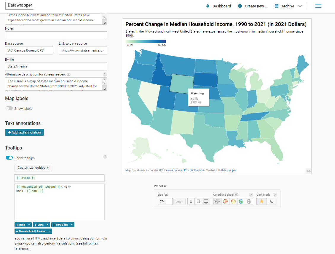
Now comes the fun part! The base map with the data should appear in the right panel, while the left panel will give you a multitude of customization options. Under the Refine tab, you can select a new color palette. Make sure the radio button next to “continuous” is selected, as this is a continuous data series (as opposed to a discrete data series, which are best used for categories of data). Under “Legend,” most of the defaults are appropriate, but since these are percentages, in the “Format” box you should select a format with a percent sign, such as “0.[0]%”. Feel free to play with the other options until you get a look you want.
Next, move to the Annotate tab. A good visualization has a title, a source and a link to that source, at minimum. Type a title for your map, such as “Percent Change in Median Household Income, 1990 to 2021 (in 2021 Dollars)”. You may want to add in a description or notes if you’d like to add in some commentary or storytelling. Perhaps you’d like to say, “States in the Midwest and northwest United States have experienced the most growth in median household income since 1990.” The data source is the U.S. Census Bureau Current Population Survey, and the StatsAmerica team would love it if you linked to the States in Profile table. For accessibility, it’s also recommended to type in a description for screen readers.
This is an interactive map, so tooltips are a must. They should already be included. Click on Customize tooltips for more options. Since these are percentages, type “%” after “{{ household_adj_income }}”, and, just for good measure, let’s add the rank by selecting the button + Rank. But they don’t look great on the same line. So, after the %, type “<br>” to add a line break. See Figure 5 for some of the options and annotations that we used.
Figure 5: Some of our map options and annotations
On the Layout tab, you can change options like the theme and enable dark mode. You can also customize the footer by adding a data download—which you should absolutely do—as well as an embed link or social media share buttons. Finally, underneath the map, you can increase the size or check for colorblindness issues. Once you’re satisfied, click “Proceed.”
Now, you have options to download the map in a PNG file or, better yet, have an embed link sent to your email. You’ll need to create a Datawrapper account if you’d like to save your creation and embed it. See below for our interactive version.
We hope this tutorial has demystified data visualization and helps you create your own. As the tutorial showed, it doesn’t require much data expertise or expensive software to create some stunning visuals to support your data story.